When a No-Longer Non-Museum Museum is Still a Museum To Me
Seven Buildings, New Haven
Various Dates
Dec 2010 Update: I received a comment on an old museum page about the modernist Knights of Columbus Museum from a woman representing the New Haven Preservation Trust who says that a survey is being done in 2010 that will add a ton of buildings to this “museum.” I’m equal parts excited and scared. I know of MANY buildings that should be part of this project, but I’ll wait to see what the fine folks at NHPT come up with – and hopefully revive this “museum.”
[Note: Out of necessity, I have lifted a few photos for this page.]
…………………………………………………….
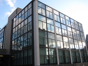 I’ve been sitting on this one for about two years. Not because I haven’t yet seen “all” of the “museum,” no… But rather because not only isn’t this an actual museum in the normal sense, but also because it no longer exists.
And yet, it does still exist. On top of that, I find it fascinating, beautiful and interesting.
Let me (try to) explain. There is and never was an actual “Urban Museum of Modern Architecture.” If there was such a thing, Hoang would have become a donating member I think. The idea – the awesome idea – was the brainchild of Marisa Angell, a PhD student at Yale back in the 90’s I think. (Information on how this whole thing came to be – and then to cease – is scant.)
The current seven buildings are:
1. The Yale University Art Gallery, 1951-53. Louis I. Kahn.
2. David S. Ingalls Hockey Rink, 1956-58. Eero Saarinen.
3. The Beinecke Rare Book and Manuscript Library, 1960-63. Gordon Bunshaft
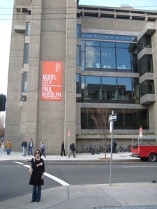
4. The Art and Architecture Building, 1958-63. Paul Rudolph.
5. Crawford Manor, 1962-66. Paul Rudolph.
6. The Yale Center for British Art and British Studies, 1969-77. Louis I. Kahn
7. The Dixwell Fire Station, 1967-74. Venturi & Rauch.
However, I was able to find the following paragraph which explains Angell’s idea and intent:
 New Haven is an open-air museum of post-war American architecture. It is one without wall labels, without any means of communicating information to the people who use and pass by these buildings every day. UMMA: NEW HAVEN rectifies this dilemma by providing historical information to the public about seven of the city’s architecturally significant buildings of the post-war era. “People want to know more about modern architecture,” says project director, Marisa Angell, “they just don’t have the time or the means to educate themselves about what is sometimes an intimidating and esoteric field.” She adds, “Architecture exhibitions, books and images on the web are a good supplement, but they cannot replace the physical experience of being inside of a building and inspecting it – sometimes touching it – firsthand.”
Amen sister Angell, Amen.
I found out about this project while visiting the stunning Beinecke Rare Book and Manuscript Library (More on the building below, don’t fret.) Just as we were about to leave, I noticed a kiosk with some information mentioning the Urban Museum of Modern Architecture. I stopped in my tracks; stunned. How did I not know about this? Where was it?
 I of course Googled the thing and found the info that I have on it. I contacted someone at Yale who told me that it was merely a PhD thesis and there were no more brochures and she wasn’t sure if all the kiosks remained. Sigh.
But… the seven buildings that make up the “museum” certainly do still exist and at least five of them are open to the public to explore and yes, to touch and experience. Heck, two are “real” museums and two more are CTMQ-qualified museums! All are unique and incredibly interesting architectural gems, designed by some of the best mid-century modern architects in the world.
As I said, the original project had a few more tangible aspects to it:
UMMA: NEW HAVEN has two components. Each of the seven buildings is the subject of a brochure that is available to the public free of charge in the lobby of each building. The brochures provide information about the architect and the design and construction process, along with images of the architect’s other significant work and a walking map of the seven sites.
Then along came the InterWebs so I think I can cobble together the important background info on these buildings that probably was included in her brochures.
Let’s check out the seven buildings that make up New Haven’s just-now re-opened UMMA, presented in the order they were built:
…………………………………………………….
1. The Yale University Art Gallery, Louis I. Kahn (1951-1953)
CTMQ’s visit to the art gallery
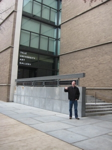 Wonderful. Just wonderful. When it comes to “bang for your art loving buck,” this may be your best bet in the state. First, it’s huge; probably second only to the Wadsworth in size. Second, it’s F-R-E-E, free, free, free. And third, the building was designed by Louis Kahn, one of the foremost architects of the 19th century. Although I just checked his list of “important buildings” on Wikipedia and really, he’s not as famous as I thought.
He is/was famous for being a scab though. Kahn had three separate families going at the same time, unknown to each other. That seems to be epidemic in the world of mid-century modern architects. (Check out the documentary move, My Architect: A Son’s Journey to learn all about Kahn – and you should, because he appears again later “in” this “museum.” Plus, it’s a really good movie.)
Wiki: Louis Kahn’s work infused the International style with a fastidious, highly personal taste, a poetry of light. His few projects reflect his deep personal involvement with each. Isamu Noguchi called him “a philosopher among architects.” He was known for his ability to create monumental architecture that responded to the human scale. He was also concerned with creating strong formal distinctions between served spaces and servant spaces. What he meant by 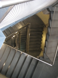 servant spaces was not spaces for servants, but rather spaces that serve other spaces, such as stairwells, corridors, restrooms, or any other back-of-house function like storage space or mechanical rooms. His palette of materials tended toward heavily textured brick and bare concrete, the textures often reinforced by juxtaposition to highly refined surfaces such as travertine marble.
That’s what the smart people say. I say that the building is simply cool. The unique stairwells (don’t you dare take the elevator) that mirror the unique triangle ceiling things… it all comes together.
Says Yale: The Yale University Art Gallery was Louis I. Kahn’s first significant commission and is widely considered his first masterpiece. Designed while Kahn was a visiting critic at the Yale School of Architecture, the building—the first of three art museums that he would design—represented a dramatic point of departure for American museum architecture as a whole. Constructed of brick, concrete, glass, and steel, and presenting a windowless wall along its most public façade, the building was a radical break from the neo-Gothic buildings that characterize much of the campus, including the adjacent Swartwout building. Kahn’s design has been celebrated not only for its beauty, geometry, and light, but also for its structural and engineering innovations. Among these is the housing of electrical and ventilating systems in hollow concrete tetrahedrons that make up the ceiling, appearing to float overhead. When it opened in 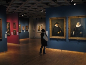 November 1953, the “Yale University Art Gallery and Design Center” included expansive, open spaces for the exhibition of art, as well as studio space for use by art and architecture students.
I’m sorry, not triangles but tetrahedrons. And they’re not done with the building yet. A recent renovation and expansion – and expansions to be – continue, from Yale:
The improvements have restored the building’s five floors and now reflect more fully Kahn’s original intention for the building. Loft-style spaces allow for versatile exhibition spaces and temporary exhibition spaces for works on paper, and two large object study classrooms enhance our teaching mission. A dramatic public lobby provides a welcoming space for students and the public to gather and guides visitors to our expanded permanent collection galleries.
The next phase of the Gallery’s expansion project will include the full renovation of the two historic structures adjacent to the Kahn building—the 1928 Gothic-style Swartwout building and the 1866 Street Hall. Their careful conversion will enlarge exhibition spaces, collection study rooms, and classroom facilities. With the completion of this project, the Gallery will span more than an entire block of Chapel Street.
You should visit. Two free museums in one! You can’t beat that with a tetrahedron.
Link to a video of the building’s restoration (Awful RealVideo)
Yale University Art Gallery
…………………………………………………….
2. David S. Ingalls Rink, Eero Saarinen (1956-1958)
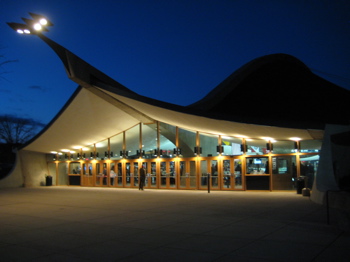 Why is this UMMA idea so good? Because most of these joints are multi-functional as far as CTMQ goes. That is, not only are they part museum, but they they ARE museums. Or in this case, they are home to the number one hockey team in the nation – at least at the time of my visit in December 2010. That’s right, Yale hockey is good; really, really good. I was excited to take in a game while they were ranked number one – I wrote about the game experience here – only a little more than I was about getting up close and personal with Eero Saarinen’s crazy hump-backed love it-or-hate it masterpiece: Ingalls Rink.
The rink, named for David S. Ingalls ’20, a two-time Eli captain, is a very unique building. I happen to love it, but there have been plenty of detractors over the years. An article from 1958 when the rink was completed laments its inclusion “in the midst of buildings prized for the traditional Gothic and Georgian architecture that abounds on the Ivy League campus.” But then the article capitulates a bit with, “the rink is a major departure from the hide-bound thinking behind the conventional types of arena design.”
 From the same article: “The design is so new and different that one is either completely fascinated by its sweeping architectural lines, or reacts as former President Truman did on a recent visit to Yale. He called the rink “a nightmare.” That’s pretty funny.
But Saarinen wasn’t just some goofball. He’s the guy who designed the St Louis Gateway Arch, Dulles Airport, the TWA terminal at JFK and the Womb Chair. Saarinen was a real-life Jetson style designer. There are no straight lines in the walls or the roof of the rink. Lengthwise, the arched backbone of the room is parabolic in shape. The ribbed roof is concave, and the side supporting walls are curved, horizontally AND vertically, leaning away from the room to give additional balance to the super-structure.
No truss supports or columns clutter the interior. At the time, the building was the only structure of its kind in the world to be used as a hockey rink. And Yale was the first university in the country ever to utilize the suspension-roof principle to one of its buildings. (Yale was also the first school to have a mascot in the country. And the first to have a sailing club. And the first to play an intercollegiate hockey game. I could go on…)
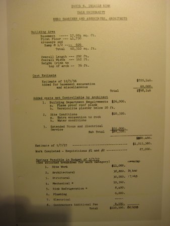
Back in the day, the roof was said to be “alive” because it expanded two inches higher in the summer due to the new material called neoprene used on it. Due to all this revolutionary design, the budget crept from the original $700K up to over $1.3 million. However, Yale considered it a boon because they “paved the way” for other suspension-type buildings and would be considered a leader in the field.
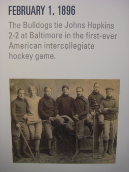 From Yale’s Ingalls website: There may be no rink in all of college hockey as distinctive as Yale’s own David S. Ingalls Rink.
Since hosting its first intercollegiate game on December 3, 1958, when the Bulldogs faced Northeastern, the rink has been an architectural marvel. Designed by noted architect Eero Saarinen ’34, the arena gets its distinctive exterior look from a humpbacked roof, supported by a 300-foot backbone. As a result, the building has been compared to a Norse helmet and a brontosaurus, but neither of those names stuck like the Yale Whale, the arena’s most common colloquialism.
“On its own, Ingalls rink is a building full of tradition and character. However, if you have been to Ingalls on a Friday or Saturday night in the winter, you have seen and felt the Whale come to life,” said former Yale player Ray Giroux ’98, a former Yale All-American hockey player.
Because of the extensive ongoing activity, the University has been continually upgrading the facility over the past two decades. A major renovation that spanned from 2008 to 2009 has preserved that tradition while also dramatically adding to the usable space in the facility. It now contains a strength and conditioning center, numerous locker rooms, equipment rooms, an athletic medicine center, a varsity player lounge, coaches offices and a reception room (named after the Schley Family) that houses Yale team photos dating back to 1895. There are new historical displays, a championship banner and concession stands and bathrooms.
“There are very few sports venues today that allow you to watch a game while feeling like you are going back in time. Ingalls Rink – with its stunning architecture, intimate charm and rich history – is one of those unique facilities,” said Teddy Werner ’98, former voice of Yale hockey on WYBC Radio.
One last blurb, from the Architecture at Yale website: Whether you think it looks like a Viking ship, a turtle, or a whale, the Ingalls Rink is without a doubt one of Yale’s most important examples of post-war modernist architecture. While the average hockey rink is more of a shed than anything else, this rink’s swooping roof seems to echo the movement of skaters, while providing seats for 3,000 spectators in a remarkably intimate setting. Of course, Ingalls is an oddly located building, and does not make much of an attempt to fit in with its residential and academic neighbors.
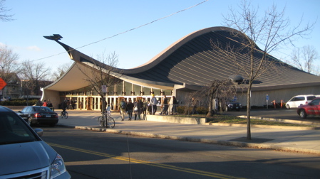
I love the building. I love the fact that it is completely out of place on the campus of Yale. I think it’s just a beautiful and functional building and certainly a worthy addition to the UMMA.
…………………………………………………….
3. Beinecke Rare Book and Manuscript Library, Gordon Bunshaft of Skidmore, Owings and Merrill (1960-1963)
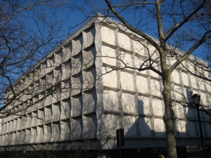 While it’s impossible to determine which of the seven buildings is my favorite, the Beinecke is certainly at the top. Sure, it looks like just another blah rectangle building, but it’s not.
At all.
Once inside, it’s astonishing. The low-light level is to protect the rare books the building houses – books like one of the 48 extant editions of the Gutenberg Bible and some Audubon originals – not to mention the hundred thousand others. But the thin marble panels that look opaque from the outside actually filter the light inside. Genius.
So who was the genius who came up with this idea? None other than Gordon Bunshaft of the famous firm Skidmore, Owings and Merrill. You may know another of Bunshaft’s buildings, The Lever House in New York City.
More: The building, of Vermont marble and granite, bronze and glass, was built by the George A. Fuller Construction Company as the general contractor. Work began on the building in 1960 and was completed in 1963. The white, gray-veined marble panes of the exterior are one and one-quarter inches thick and are framed by shaped light gray Vermont Woodbury granite. These marble panels filter light so that rare materials can be displayed without damage. From the exterior, however, the building’s powerful stone geometry serves to dominate the space it occupies in Hewitt 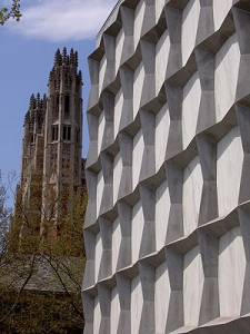 University Quadrangle, amidst neo-Classical and neo-Gothic neighbors. Also visible across the plaza is Alexander Calder’s “Gallows and Lollipops”.
A revolving glass door provides public entrance to the Beinecke Library. Upon entering, visitors see the glass tower of books that rises through the core of the building. Two stairways ascend on either side to the mezzanine level. Together with the entrance level, the mezzanine functions as a showcase for rotating exhibits that highlight the Beinecke’s rich collections.
If you read my visit review that I linked above, you’ll see more. I seriously love this building – especially as it’s smack-dab in the middle of a bunch of gothic stuff.
Online Tour of the Beinecke
Isamu Noguchi’s sunken marble garden in front
…………………………………………………….
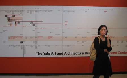
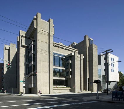
4. Yale Art and Architecture Building, Paul Rudolph (1958-1963)
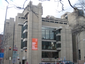 I won’t bludgeon you with the long and winding road this building has taken. That would be brutal.
Did I say brutal? Yes, I did. That’s because Rudolph designed this building in the “Brutalist” style. And even if you don’t know what that really entails, just bump into a wall here. The rough-as-hell cement used hurts to touch. What kind of nonsense is that!?
Well, first things first. From a source far, far more educated on this stuff than , regarding the 37-level (!) building and its recent restoration:
Architecture Week: The Yale Art and Architecture building in New Haven, Connecticut, designed by legendary architect Paul Rudolph and completed in 1963, is now close to how its architect intended it to be, after a 45-year journey through celebration, fire, indifference, and abuse.
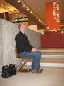 One of the most iconic architecture school buildings in the world, the object of a love-hate relationship with those who have known it, has found new repose amid a complex mixture of adoration, restoration, and exhilaration.
The restoration of Rudolph’s masterwork, and the addition of an adjoining building for the art history department, are the work of New York architect Charles Gwathmey, a former student of Rudolph’s who actually worked on the original building. The $126 million effort was guided by Yale’s architecture dean, Robert A.M. Stern, who as a Yale student in the 1960s gave tours of Rudolph’s concrete castle of architecture.
Architecture in the Raw
The building made Rudolph one of the most famous architects of his time. He came to Yale in 1958 as chair of the architecture department, and started work on a new home for the art and architecture programs. People have typically either loved or hated this elementally expressive building. The Yale president who hired Rudolph, A. Whitney Griswold, said that the building’s fractured fin walls gave him a “concrete sore.” The building burned in 1969 during the height of student protests at Yale, in a fire the authorities officially pronounced “accidental.”
Later alterations that boarded up windows, filled in soaring spaces, and changed lighting and finishes made the building a shadow of Rudolph’s original achievement. Up until his death in 1997, the architect was reluctant to talk about it. When 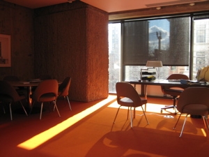 I interviewed him in 1988, 25 years after the building’s completion, Rudolph choked back tears when describing how the building and people’s reactions to it had affected him.
Reviving the Landmark
The restoration is superb. It fixes many shortcomings of the building, which has been rededicated as Paul Rudolph Hall.
As I walked around the building with Stern, he pointed out new bridges that now link levels within the studios, and carefully designed ramps. The intent throughout the restoration, he explained, was to foster a stronger sense of community within a program of 200 architecture graduate students and 50 undergraduates. (The art school moved out of the building in 2000.)
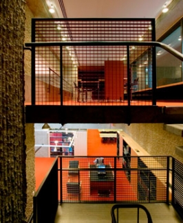 Rudolph’s original design did this through views horizontally and vertically throughout his incredible structure. Later alterations disrupted these views, virtually chopping the building into pieces.
The restoration liberates Rudolph’s spaces, allowing them to reconnect visually and acoustically. You can now stand within the volumes and experience students working above, below, and nearby. There is a renewed connection between the studios, which adds to the excitement of Rudolph’s multilayer spaces.
Stern told me that when he came to Yale as dean of the architecture school a decade ago, the faithful restoration of Rudolph’s building was high on his priority list. He is justifiably proud of the result. As we walked around the building, he would occasionally stop to scribble notes about burned-out light bulbs, or to spruce the place up by pulling weeds from a flower box. At one point he teasingly reprimanded a student for messing up a roof terrace with model shavings.
Much of Gwathmey’s restoration and renovation work is either invisible or so well tuned to Rudolph’s original vision that it appears to have always been this way. The exterior was cleaned and repaired, replacing patches of the original hammered rib texturing where necessary.
You can read the rest of the article here.
Hoang and I visited the A+A building to see an exhibit on Rudolph himself. He was certainly a conflicted man, who designed conflicted buildings. Many of them are no longer standing, and some of them were abject failures, like his housing projects in New Haven that were structurally unsound and actually rather ugly.
Not that the A+A building isn’t ugly too. It is… But in a strangely beautiful way.
Some excellent commentary on why the building was so hated… And loved.
…………………………………………………….
5. Crawford Manor, Paul Rudolph (1962-1966)
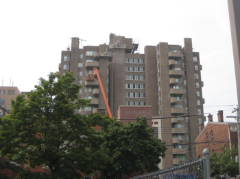 Of the 7 current buildings that comprise the UMMA, 2 of them are not exactly tourist friendly. Crawford Manor is one of them, as it is merely a high-rise apartment building in downtown New Haven. The thought crossed my mind to park and enter the lobby in the hopes of finding one of the old UMMA kiosks, but I decided against it.
The building is easy to spot from several blocks away in all directions. Like most all of Rudolph’s work, the building is stark and probably very polarizing. Let’s give the architect his say:
“From a distance, the building stands like a stalk, a tower, for the residents to point to as their home. From a closer vantage point, the scale breaks down, and the building becomes a series of piers separated by balconies. The articulation of the individual living units aids each resident to identify his own apartment.”
I do so love architect-speak. I could identify all the roped-in workers repairing the façade and structural frailties of Rudolph’s building on the day I “visited.”
On this project, Rudolph used pre-cast cement blocks, which were cheap and readily available. Let’s get some more Rudolph now:
“The understanding and help of local and Federal officials for public housing, 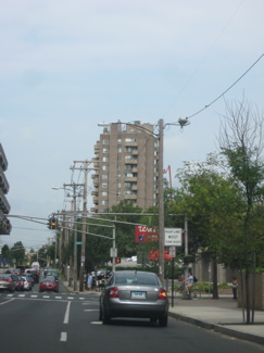 an exceptional major, and a good site, permitted this most difficult exercise in the economics of building to be fulfilled. The vertical thrust of the piers balanced by the axis of balconies at 90 degree angles to each other gives this building a sense of restrained, dynamic energy. The utilization of a special precast block for all exterior surfaces breaks down the scale of the building, enables it to weather well and helps to keep the building within the stringent economic limits imposed on public housing in the United States.”
Rudolph, as you read above in the A+A building’s blurb, loved to use concrete. Ugly, sharp and jagged concrete actually. But Philip Johnson digs the building too:
“Those balconies in the Crawford Manor are an alternation of thrusts, one out from the building and one parallel to it, in order to emphasize the essential organization of the building. If all of the balconies thrust forward, then the result from a distant view would be a kind of shaft. But by making the thrusts of the balconies oppose each other, one senses the cubicle nature of the interior.”
Yes, yes they do.
Far, FAR better photos of Crawford Manor
…………………………………………………….
6. The Yale Center for British Art, Louis I. Kahn; completed by Pellecchia and Meyers (1969-1977)
Not Yet Visited.
…………………………………………………….
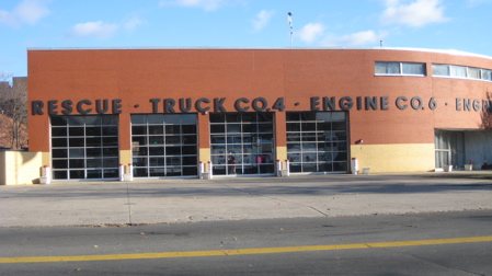
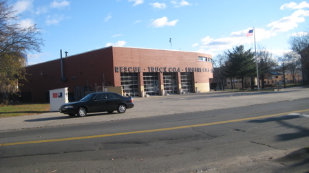
7. The Dixwell Fire Station, Robert Venturi and John Rauch (1969-1974)
Gotta love the inclusion of this fire station. Such a functional building, devoid of any of the pretension and pure design elements elsewhere on this list. Of course, this limits what I can write about it and on top of that, I wasn’t about to just walk into a fire station on the edge of a rather sketchy neighborhood… So we’ll rely on other sources for this bit… Which is pretty much what I’ve been doing here anyway.
Unlike most of the other architects on this page, Robert Venturi is a not a mid-century modernist. In fact, Venturi is known for coining the maxim “Less is a bore” as antidote to Mies van der Rohe’s famous modernist dictum “Less is more”. I’m not sure how I feel about all that, but I do like his random fire station on Dixwell Ave.
Oooh, architect-speak:
This building, on a corner at the edge of downtown New Haven, is big in scale but simple in form — it contains big elements in a simple form. The program requires conventional facilities for a fire station, including a six-truck apparatus room, auxiliary spaces, and living quarters for firemen. The building is located diagonally on the site to permit efficient egress by the trucks and to have the living quarters face south.
That said a whole lotta nothin’. Here’s something – the fire station is directly across the street from the Prince Hall Masonic Temple, part of Freedom Trail in New Haven. Let’s try some more:
The letters on the facade identify it in the traditional manner of civic buildings, but when the letters reach the corner the wall breaks away and cantilevers to make a kind of brick signboard. The corner of the building is rounded to soften its diagonal placement and to tie the two street facades together. The polychromatic brick pattern on the front enriches the facade and enhances its quasi-civic scale. At the same time, changes in color and detailing give the low building the traditional bottom, mid-level and top.
Yeah, okay.
UMMA
Several more sprinkled throughout, above.

 Justin McGuire says
February 13, 2016 at 10:37 amGreat article, I’ll be doing this soon. Thank you.