Something’s Breuering
Hotel Marcel, New Haven
August 2023
Since when did I start staying in and writing about “Hotels of Connecticut?” Today, I guess.
Just don’t let me get any notions of pursuing “Motels of the Berlin Turnpike” please.
There are a few high-end hotels on a couple lists I’ve been listlessly completing, like “1,000 Places To See Before You Die” and there are a few rather interesting Air and Traditional Bed & Breakfasts that I have penciled in to stay at someday. Suffice it to say, hotel overnights are very low on the CTMQ list of importance.
But this particular stay was particularly important to me and my wife. Not only is it an incredibly cool property, it was the first overnight we’d had alone since our older son Damian was born. And there was purpose to this night… it was as test run to see if we could go away for more than one night two months later.
Our son Damian’s Smith-Magenis Syndrome be incredibly difficult, but we’d secured the services of an awesome human being who has worked with him for years and checked all of our boxes to be able to care for him in our absence. I made the reservations, planned an evening, and away we went.
First to Rose Vineyards and Winery in North Branford, which was pretty great. Of course, Hoang and I were in such a good mood that anything would have been great. But when I tell you that Olea for dinner in New Haven is pretty great, trust me that it would be pretty great any day of the year. I highly recommend it for a special night out.
Enough about food and drink. Let’s get to the Hotel Marcel.
Our night out was a long time coming… and so was this hotel.

Scallops at Olea

Calvin admiring the Brutalist architecture from IKEA, years before it was a hotel
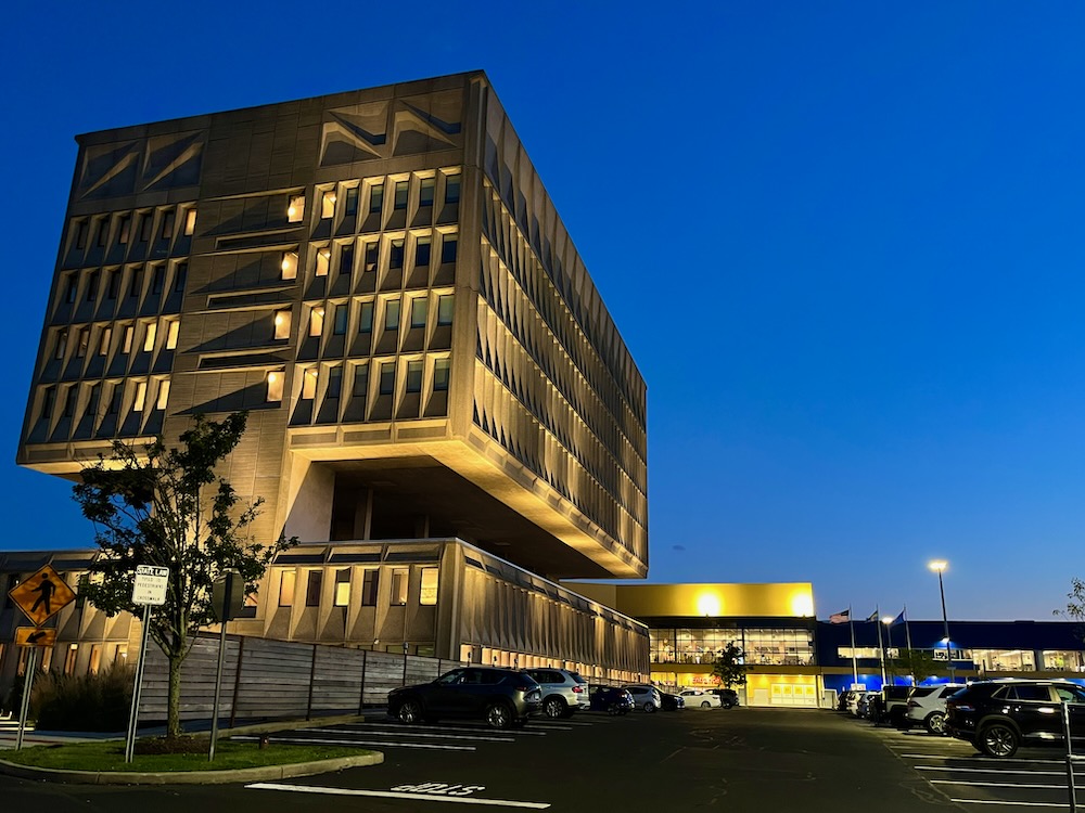
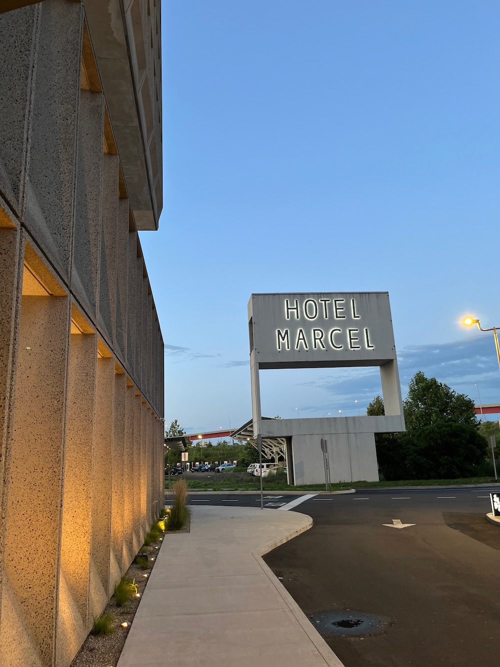
Hotel Marcel is a Hilton hotel housed in the Armstrong Rubber Company Building, later known as the Pirelli Tire Building. Okay, that doesn’t sound remotely exciting. But this is an important building, as it was a designed by modernist architect Marcel Breuer and is a noted example of Brutalist architecture. Since its renovation into a hotel, the building operates as a zero-energy building, generating enough renewable energy to sustain its operations.
The building was constructed from 1968 to 1970 and after Pirelli was done with it, they sold it in 1999. From the late 1990s into the late 2010s, the building was predominantly vacant. There it sat, right near to I-95 and in the middle of the IKEA parking lot. IKEA owned it at the time and wanted it razed, but it was saved. (Actually, IKEA did remove a large portion of the two lower floors.) Preservationists made a stink. Then it got some protection by the National Register of Historic Places. Then it was going to be an art installation. Then local developer Bruce Becker bought it and converted it into the hotel, which opened in 2022.
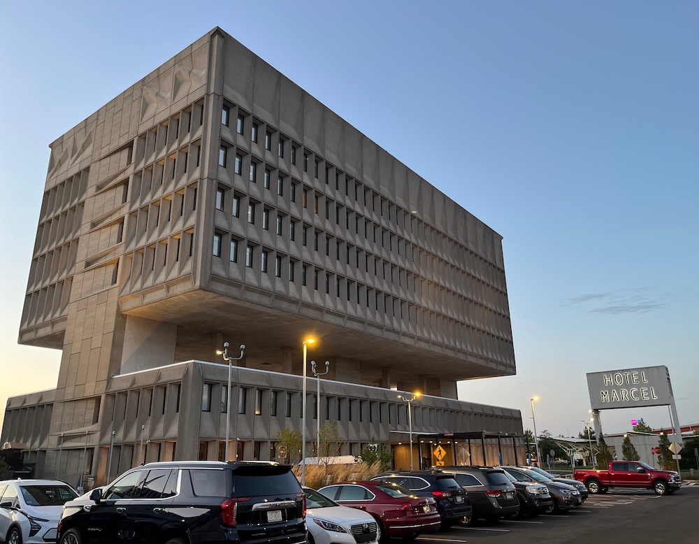
It’s location right near a major interstate junction means that millions of people have seen the building and have an opinion on it. It is striking, stark, and unique. It is Brutalist. The following is from Atlas Obscura and sounds rather apocryphal to me, but it’s a good story, regarding the building before it was built:
Mayor Richard C. Lee saw a unique opportunity. Rather than move forward with a low-rise structure, as Armstrong Rubber had planned, Lee proposed a taller building, one that would draw the attention of vehicles on the highway. The result was a concrete monolith designed by Breuer, an internationally-known modernist architect. Breuer, a Bauhaus alumnus, believed that sections of a structure should be separated by their functions. He designed this building in two sections: a two-story research and development space, and a four-story office building suspended above it. The negative space between these two sections serves twofold: while it was supposedly meant to reduce sound in the offices above from the labs below, it also frames a snapshot of the city’s skyline from the perspective of passing drivers.
Many locals hated it. A 2018 Business Insider article ranked it as the state’s ugliest building – remember Hartford’s Butt Ugly Building was finally razed in 2010. But in architecture circles, it is regarded with reverence. Metropolis Magazine says, “it is probably the most prominent work of Modern architecture in the Northeast United States, and one of Breuer’s best-known buildings.”
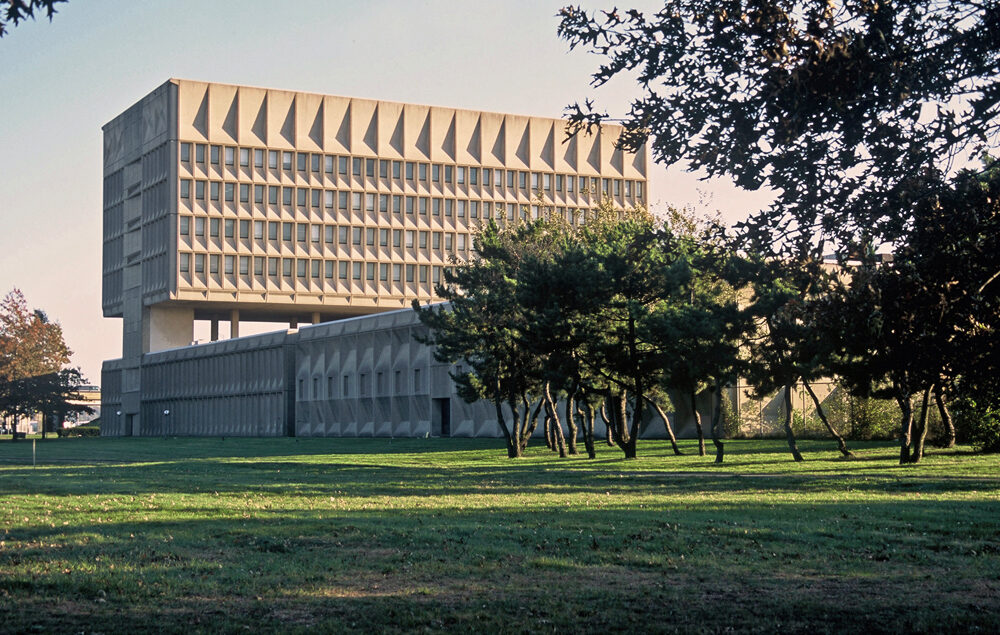
Here it is before IKEA removed most of the ground level structure, from Metropolis Magazine
My opinion? First and foremost I’m glad that mid-20th century modern architecture is getting its due with “national historic” designations. Connecticut has a trove of iconic buildings (mostly private residences) that fans of certain styles travel to see. I personally prefer the glass and steel austerity to the concrete austerity of Brutalism. But I like this building.
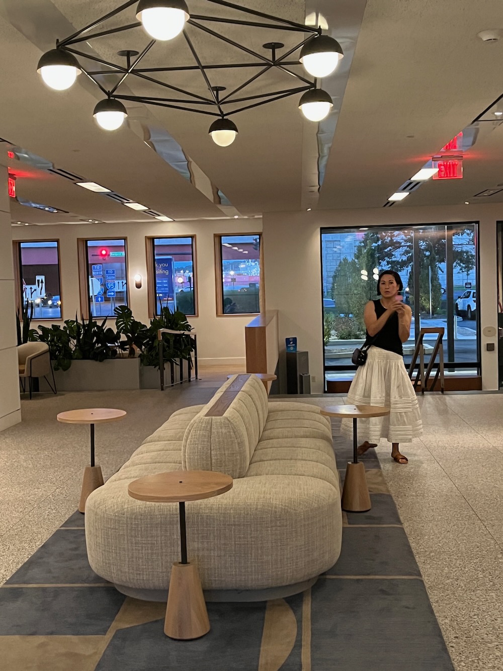
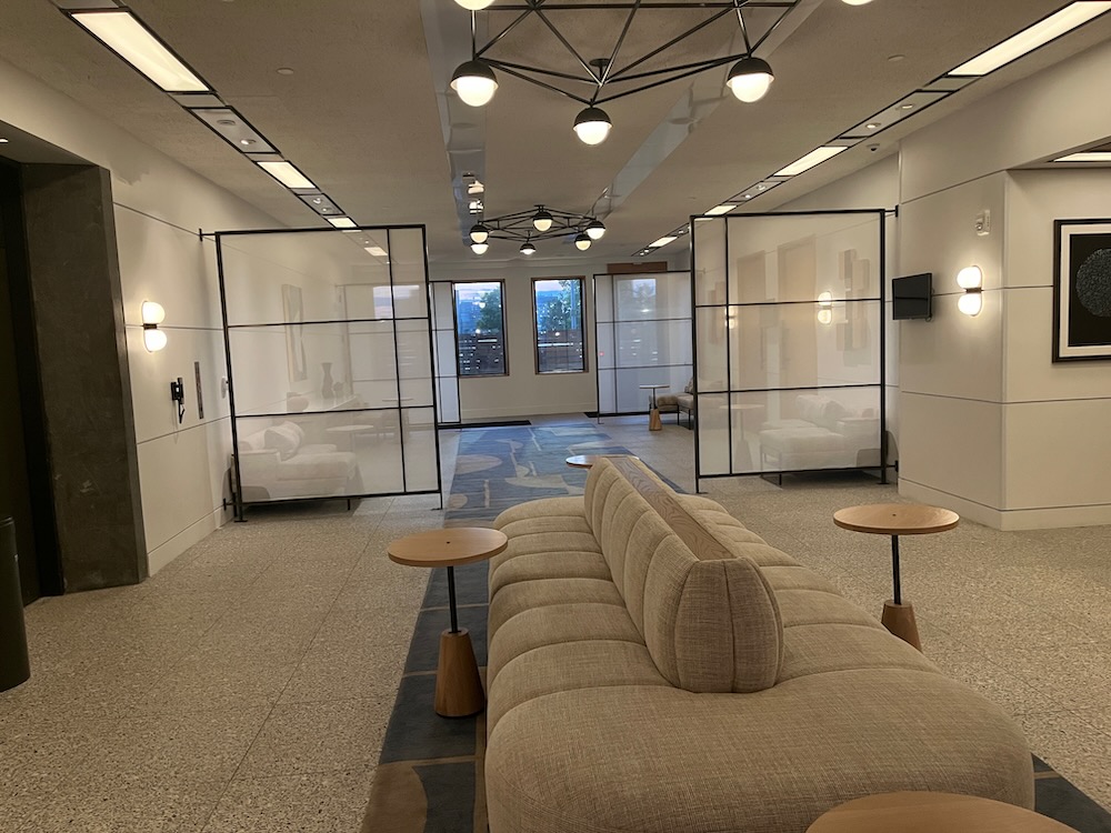
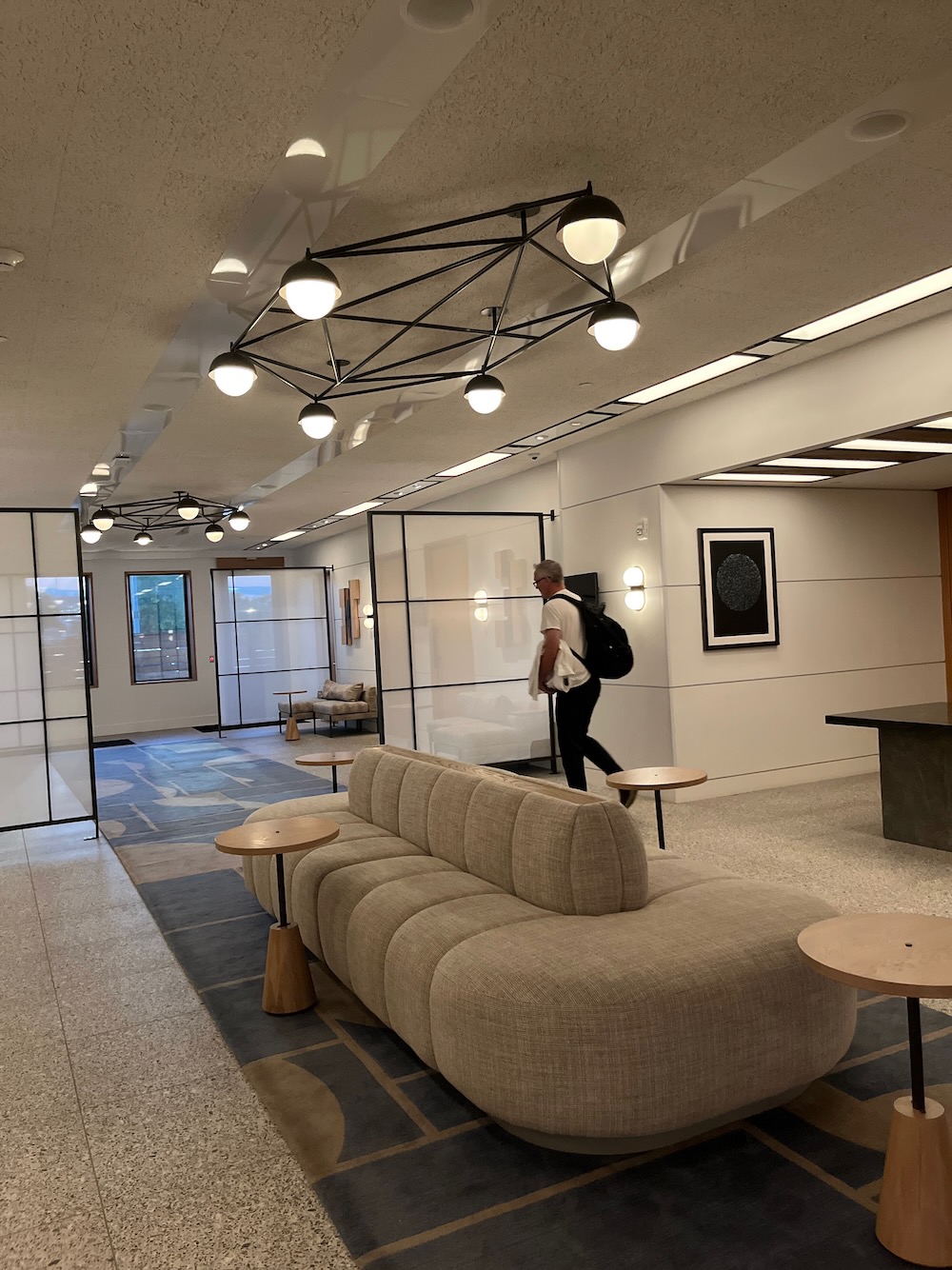
The lobby is cool. It’s a sunken lobby that originally held 1970s-era computer equipment. The bar and restaurant area is cool. Once inside this lobby level, all the “brutal” stuff simply disappears in soft lighting and earth tones. This was, of course, intentional:
For the guest rooms and other interior spaces, Dutch East Design developed an approachable scheme that paid homage to the building’s status as a Modernist icon. “Overall, the interior is kind of a softer, warmer, more human response to the building’s exterior. We’re trying to reacquaint the public with Brutalism, but in a very approachable way,” says Dieter Cartwright, partner at Dutch East Design. He refers to textile patterns inspired by Anni Albers and custom touches like maple window surrounds that match the originals designed by Breuer, only in a warmer material.
Anni Albers was a Connecticut resident by the way – and a mid-century interior design icon.
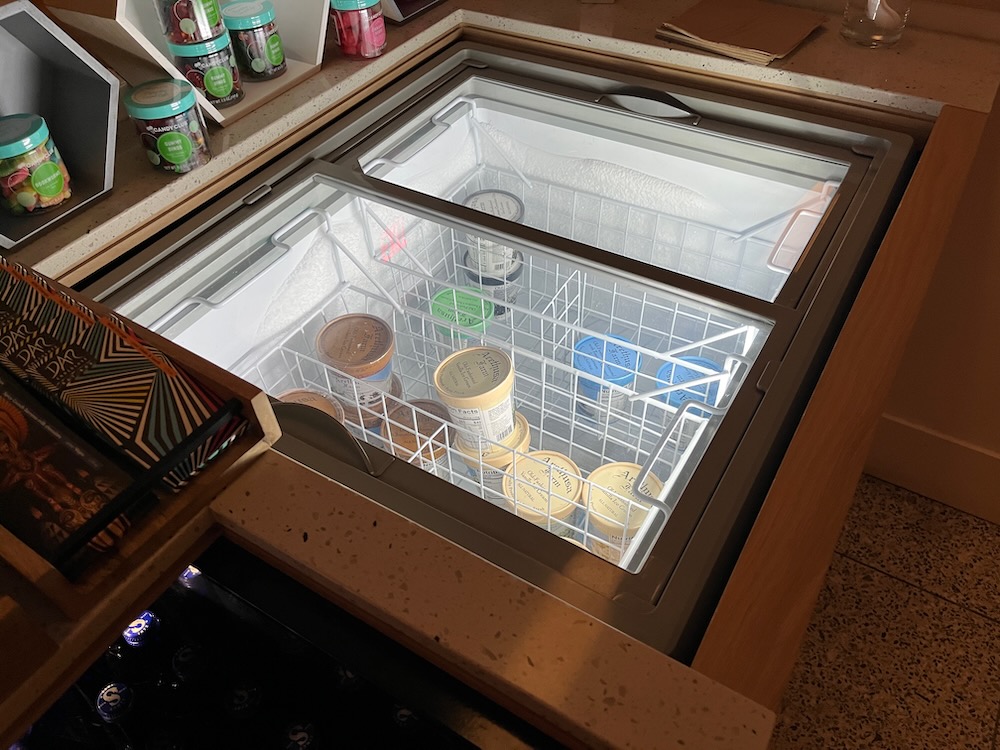
Only the best: Arethusa ice cream!
I like this Dieter Cartwright guy. Let’s here from him some more:
‘This project provided an opportunity to reintroduce the public to the raw beauty of brutalism. With the building’s architecture leading the narrative here, the interior design offers a softer juxtaposition to the concrete façade,’ say the firm’s founders Dieter Cartwright, Larah Moravek and William Oberlin. ‘The interior palette includes warm earth tones with a textural build-up of terracottas. In the guest rooms, we wanted to achieve an openness, as they had inherited a narrow footprint. We used the principle of interlocking casegood components, using the closet to accentuate the height of the room and connect to a nightstand that wraps around to the bed wall.
‘Many artifacts of the building were surprising and inspiring, so we worked hard to celebrate them,’ they continue. ‘The cast concrete exterior window panels, for example, have a beautiful angular geometry on the interior as well as the exterior, which we’ve carefully detailed in wood to celebrate the brutalist language in the guest rooms. The building’s modular rigour established a rhythm for us to follow, but within that framework we introduced colours, textures, and furniture profiles that are as welcoming as the exterior is austere.’
Okay, Dieter, okay. That’s all a bit much.
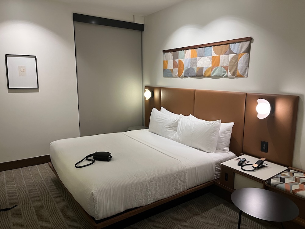
We didn’t eat or drink here, but everything looked good. The public is certainly welcome to eat and drink here as well and frankly, after an IKEA trip, this bar may be required.
My one complaint about our stay is that all the “touchless” key technology is still wonky. You need it for the elevators and your room, and I imagine it gives lots of people fits. The heating and lighting in the rooms is also “modern” and really not all that intuitive. But we somehow figured it out and had a very comfortable stay.
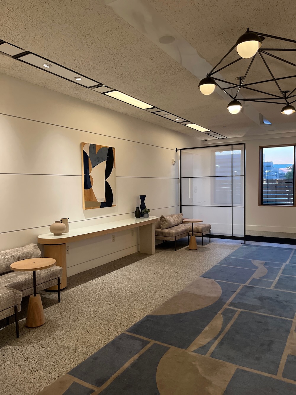
And yes, the rooms are relatively small by American standards. My approach to hotels is that they are a place to shower and sleep. I don’t need a palatial estate. Our room was big enough for our needs and my 6’3″ frame fit fine on the super comfortable bed. Despite all the modern electronics, the room retains a definite mid-century look. We dug it.
I’d be remiss if I didn’t mention that eco-friendliness of this joint. There’s a massive solar array on the roof and covering the nearby parking lots. The building’s iconic six-foot-by-three-foot windows are glazed with high performance glass that meets the Passive House Standard (and has the added benefit of completely insulating guest rooms from traffic noise.)
It’s all very cool. You know who likes this stuff way more than me? And probably way more than you? My wife. Just look how happy she is on the Hotel Marcel’s bed:

Who looks this good at the end of the day?!
My goodness she is beautiful. I really need to adopt her skincare regimen. Anyway, I’m happy to report that our “date overnight” was a success both for us as well as at home. So much so that we went to Paris a couple months later with confidence that both of our sons were in good hands (and they were).
If you are looking for a “staycation,” I’d recommend this place. It’s in our most interesting city and is certainly one of the most interesting hotels. Go for it.
![]()
Hotel Marcel
CTMQ’s Hotels, Air B&B’s, and Traditional B&B’s

 Peter says
December 8, 2023 at 10:25 amDunno about those Olea scallops …. the ratio between “empty plate” and “actual food” is not a favorable one …
 Greg Amy says
December 9, 2023 at 9:22 amThanks for the write-up. I’ve admired that building for years – I’m a fan of Brutalist and Mid-Century Modern – but just never stopped. Maybe now I will.
As for “pursuing ‘Motels of the Berlin Turnpike'”…you mean all those quite interesting hotels/motels along a stretch of highway that was the main throughway between New York City and traveling north to Vermont that have a lot of fascinating stories to tell of the early days of automobile transportation along “Gasoline Alley”? Hotels that later found themselves orphaned when I-91 was built and they had to transform themselves into a different, more seedy, existence?
One can only wonder the stories that places like The Grantmoor, The Atlantic, The Flamingo, and Hawthorne could offer us…
But yeah, you don’t want to “go there” to that boring story.
 Linda O says
December 10, 2023 at 4:54 pmOut of curiosity, how do their rates compare to other lodging in the Elm City?
 Steve says
December 10, 2023 at 5:32 pmI can’t say I did any price comparisons, but I imagine it’s in the upper price range.
Funny aside… there’s a fake Breuer hotel right on the other side of IKEA – the La Quinta Inn. It’s about a third of the price.
“The structure is designed in the Brutalist style, although its severity is lessened due to the use of smooth concrete instead of the rough texture often associated with the style. It resembles the Pirelli Building by Marcel Breuer (1963), at 500 Sargent Drive.”
 Linda says
December 10, 2023 at 9:24 pmI’m going to have to check out that LaQuinta next time I go down to the IKEA!